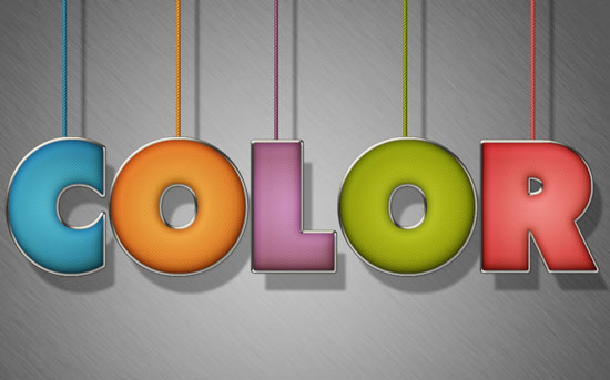
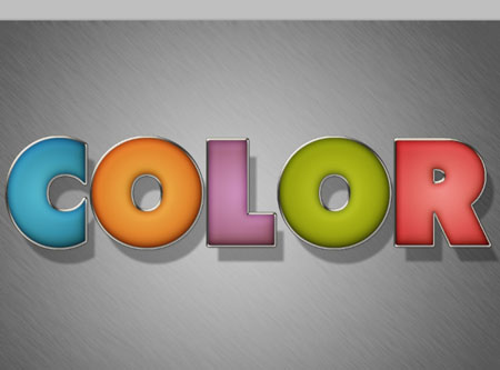
The Final Result:
Notes:
* the software used in this tutorial is Adobe Photoshop CS5 Extended
* the size of the final result image is 1024 * 768
* you might want to check the Basix Page to see some useful topics on dealing with Photoshop basics, such as loading palettes and some shortcuts.
Resources:
* Metal Texture 2 by ~goldberry2000.
* You might need to load the Contours used in the tutorial, so check this image to see how to do so.
Step 1:
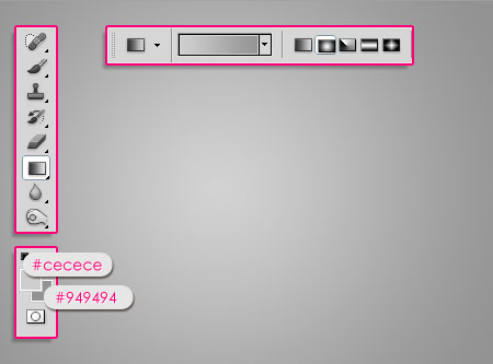
– Set the Foreground color to #cecece and the Background color to #949494. Pick the Gradient Tool, choose the Foreground to Background gradient, and click the Radial Gradient icon in the Options Bar. Then create a radial gradient from the center of the document to one of the corners.
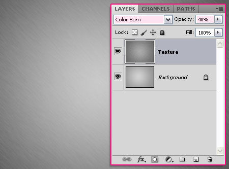
– Place the Metal Texture 2 on top of the Background, then change its layer’s Blend Mode to Color Burn, and its Opacity to 40%.
Step 2:
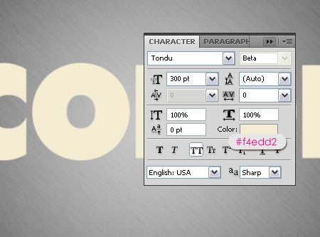
– Create the text in All Caps using the color #f4edd2. The font used is Tondu and the size is 300 pt.
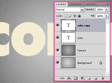
– Duplicate the text layer. We will use the first text layer to create the stroke, and the second one to create the main stuffed effect.
Step 3:
Double click the original text layer to apply the following Layer Style.
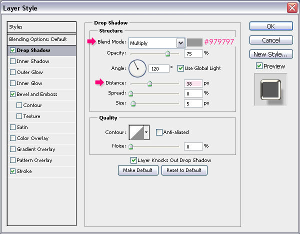
– Drop Shadow: Change the color to #979797 and the Distance to 38.
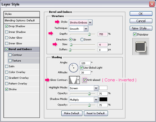
– Bevel and Emboss: Change the Style to Stroke Emboss, the Depth to 755, the Size to 4, the Gloss Contour to Cone – Inverted, and check the Anti-aliased box.
The ‘Stroke Emboss’ style will create a Bevel and Emboss effect for the ‘Stroke’. That’s why we must modify the Stroke effect values in order to see the result of the Bevel and Emboss.
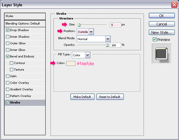
– Stroke: Change the Size to 5, make sure that the Position is set to Outside, and change the color to #f4efde. Now, you can see the Bevel and Emboss effect on the Stroke.
This is what you should get. Notice that the ‘Drop Shadow’ Distance value is quite big, which means that the shadow will be far behind the text. That’s why we used the text layer to create the stroke instead of stroking a path, as this will make sure that the shadow is filled and not empty in the middle.

Step 4:
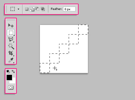
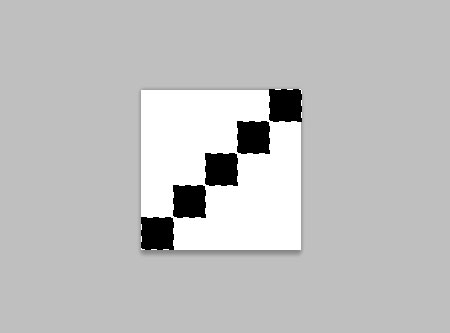
– Now, we are going to create a simple pattern. So create a new 25 x 25 px document with a White background. Then, pick the Rectangular Marquee Tool and click the Add to selection icon in the Options bar.
Create 1 x 1 px squares diagonally through the document as shown below.
– Fill the selection with Black, and press Ctrl/Cmd + D to get rid of the selection.
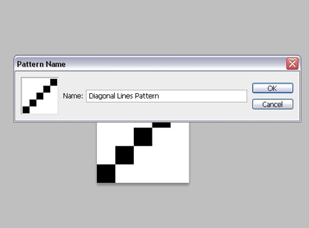
– Go to Edit -> Define Pattern, and type in a name for the pattern.
Step 5:
Back to the original document, double click the copy text layer to apply the following Layer Style.
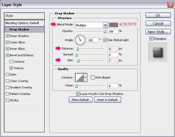
– Drop Shadow: Change the color #797979, the Distance to 4, and the Size to 7.
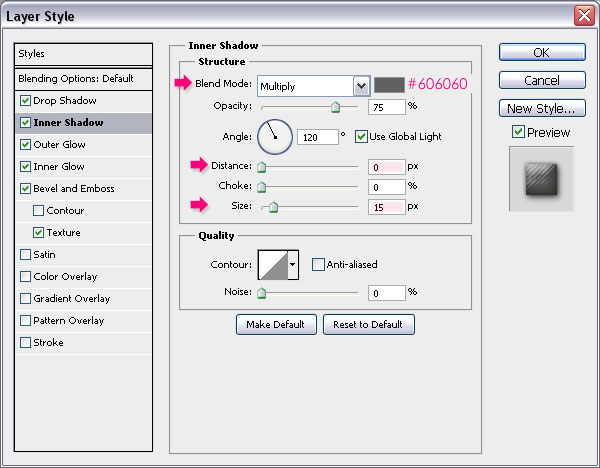
– Inner Shadow: Change the color #606060, the Distance to 0, and the Size to 15.
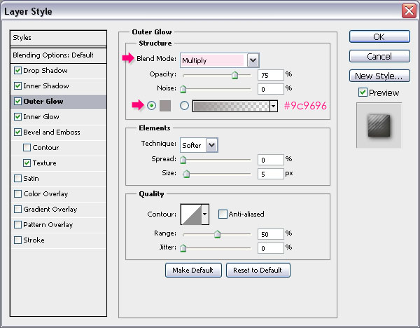
– Outer Glow: Change the Blend Mode to Multiply, and the color to #9c9696.
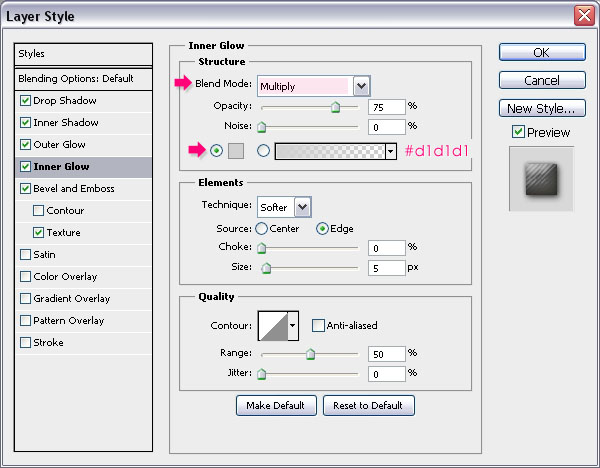
– Inner Glow: Change the Blend Mode to Multiply, and the color to #d1d1d1.
Both Glow effects are used to intensify the shadow effects by changing their Blend Modes to Multiply.
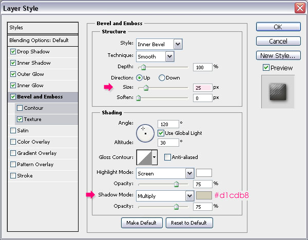
– Bevel and Emboss: Change the Size to 25, and the Shadow Mode color to #d1cdb8.
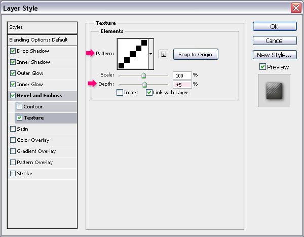
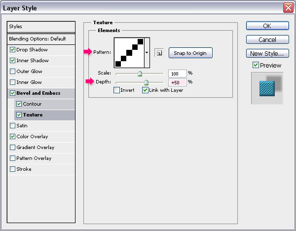
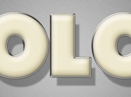
– Texture: Choose the Diagonal Lines pattern created in the previous step, and change the Depth to 5. You can increase the Depth value if you want the diagonal lines to be more obvious.
This will give the text the stuffed look.
Step 6:
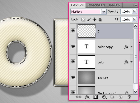
– Press the Ctrl key and click a text layer’s thumbnail (icon) to create a selection.
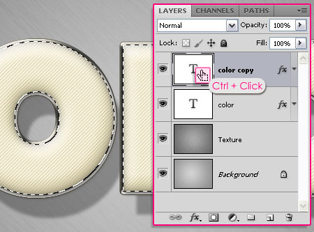
Next, we’ll be filling and applying different layer style values for each letter separately. So start with the first letter, create a new layer on top of all layers and rename it to whatever letter you’ll be working with, and change the new layer’s Blend Mode to Multiply.
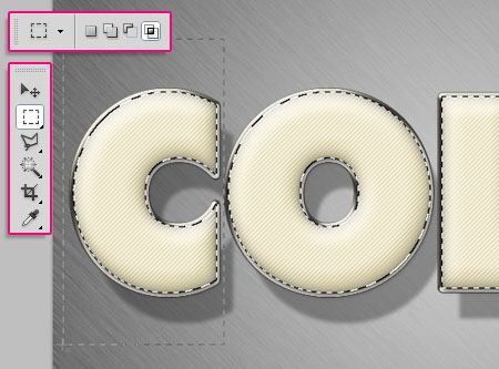
– Pick the Rectangular Marquee Tool and click the Intersect with selection icon in the Options bar. Then, draw a selection around the letter you want to work with.
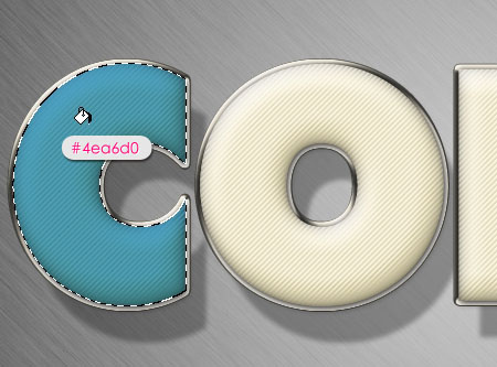
– The letter will be selected separately.

– Fill the letter with any color you like. Here, the color used is #4ea6d0.
Step 7:
Double click the letter’s fill layer (in this case, “C”), to apply the following Layer Style.
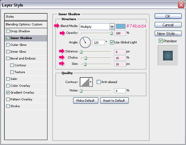
– Inner Shadow: Choose a color that suites the letter’s fill color, here, the color used is #74b6d4. Then, change the Opacity to 100%, the Distance to 0, the Choke to 15, and the Size to 18.
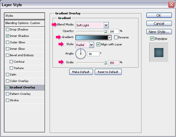
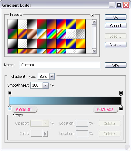
– Gradient Overlay: Change the Blend Mode to Soft Light, the Style to Radial, and the Scale to 150%. Then click the Gradient box to create the gradient used.
– For the gradient, you’ll need two colors. the color to the right is #070606 (this one will be used with all the other colors), and the color to the left is any color that goes with the letter’s fill color. You can try different colors and check the preview, then choose whatever color you like. The color used here is #9de0ff.
– This will make the letter’s fill look more vivid.

– Repeat the previous steps to each one of the remaining letters.
(Select the whole text (Ctrl + click a text layer’s thumbnail), use the Rectangular Marquee Tool to isolate the letter you want to work with, create a new layer and change its Blend Mode to Multiply, fill the selection with any color you like, apply the layer style for the letter using suitable colors for the Inner Shadow and the color to the right in the Gradient, and you’ll get some bright colorful letters.)
Step 8:
– Set the Foreground color to #d7d0c0 and pick the Line Tool. Set the Weight to 7 in the Options bar, and create a line behind the text layers as shown below.
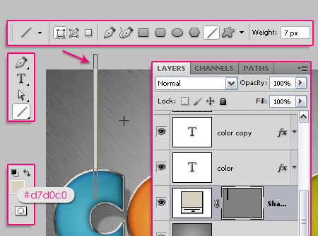
Double click the line shape layer to apply the following Layer Style:
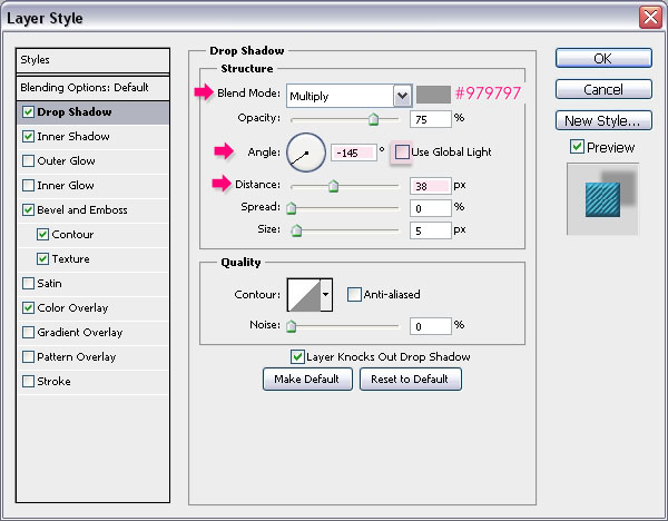
– Drop Shadow: Change the color to #979797, and un-check the Use Global Light box to change the Angle without affecting the Angle values of the other Layer Styles in the document. Then, change the Angle to -145 and the Size to 38.
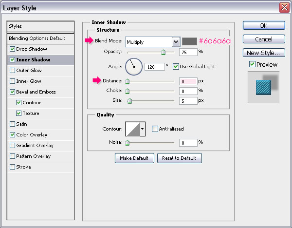
– Inner Shadow: Change the color to #6a6a6, and the Distance to 0.
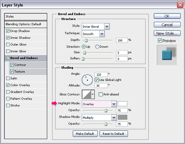
– Bevel and Emboss: Change the Highlight Mode to Overlay.
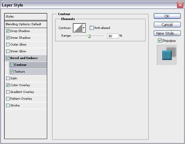
– Contour: Use the default values.
– Texture: Use the Diagonal Lines pattern and change the Depth to 50.
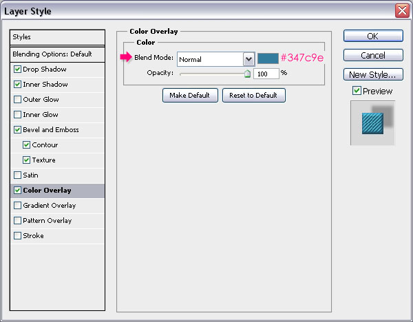
– Color Overlay: Choose a color that matches the letter’s color. Here, the color used is #347c9e.
– This is what you should get.

Step 9:
– Duplicate the line shape layer, and move the copy to the right in order to place it behind the next letter.

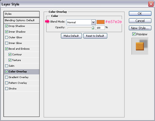
– Double click the copy layer to change the Color Overlay to a new color that matches the new letter’s color. Here, the color is set to #e57e2e.
– You can change the shape’s fill if you don’t want to apply a color overlay, but using the color overlay includes the fill in the layer style, which makes copying it to other elements easier.

– Do the same for the rest of the letters.
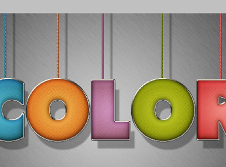
And you’re done! Hope you enjoyed the tutorial and found it useful

